Checkout Optimization: Why Fewer Fields Means More Sales
Seven out of ten customers who add an item to their shopping cart leave without making a purchase. This is just the reality we face every day. The average cart abandonment rate is a staggering 70.22%. And one of the major causes of this problem is that checkout processes can be very confusing. The good news is that making your checkout process simpler is one of the fastest ways to grow your revenues without changing your products, pricing, or marketing. If you're ready to see real checkout conversion rate optimization improvements in weeks, not months, the changes below can make a real difference to your business.
The Numbers That Should Worry You
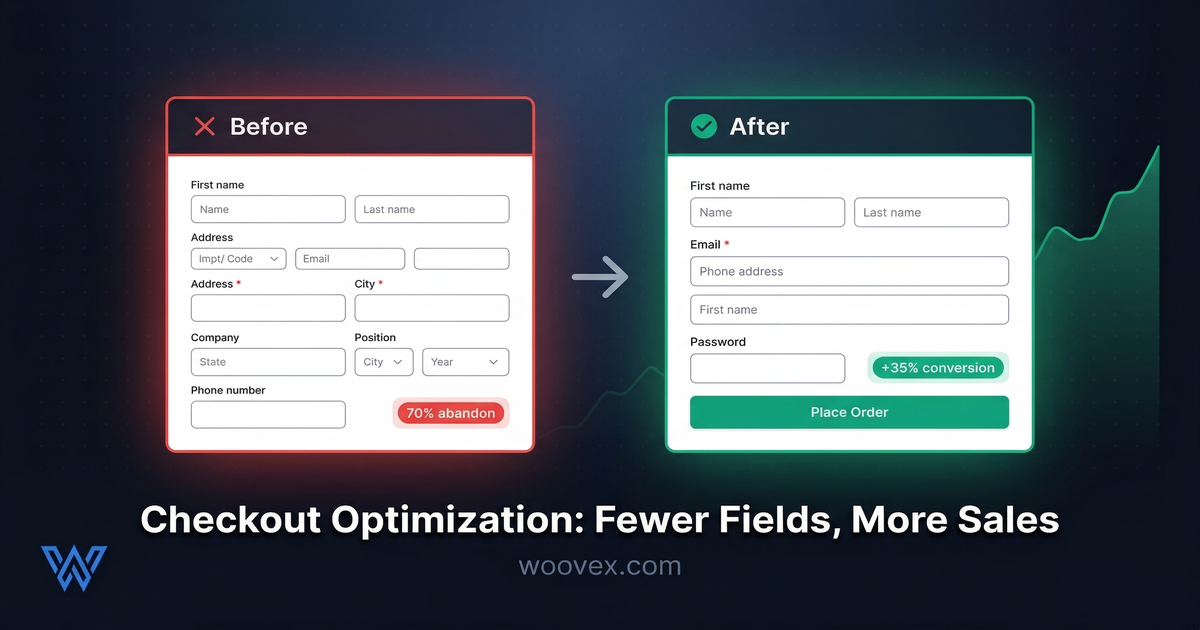
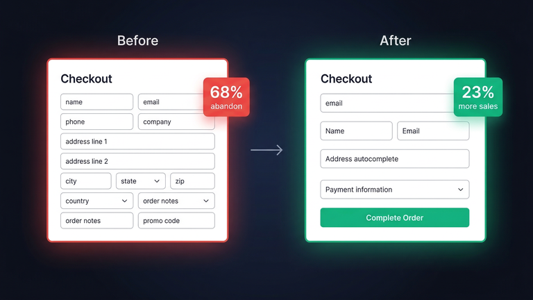
For an average ecommerce checkout, there are 14.88 form fields. The most successful checkouts have 7 or fewer. This disparity alone represents a huge opportunity for improvement.
Ecommerce sites with high traffic volumes have seen a 35% increase in conversion rates due to checkout design alone. Not from creating new products or increasing advertising spend. Simply from making it easier for customers to buy from them.
The most common reasons for cart abandonment:
- Unexpected costs (shipping, taxes, fees revealed at checkout) - being transparent about your pricing strategy is critical to reducing surprises
- Forcing users to create an account (24% of abandonments)
- Too many steps or too complicated.
- Customers don't trust the website with their information.
- Page loading issues - if your checkout takes longer than 3 seconds to load, see our guide on WooCommerce speed optimization
Again, most of these issues can be addressed without a complete overhaul of your store. To start reducing your cart abandonment rates, you need to first identify the areas where your customers are abandoning their carts.
The Case for Fewer Fields
Each field you add to the checkout process is friction. Each piece of information you ask for is another opportunity for the customer to say to themselves "is this worth it?" and leave the checkout process. Good user experience on an e-commerce site means removing every barrier between the customer and the checkout.
Consider the following questions: Do you really need a field for the customer's company name on a business-to-consumer checkout? Do you really need to ask for billing and shipping addresses? Does your phone number field get used?
Fields you can remove or hide:
- Company name - hide on business to consumer sites, make optional on business to business sites
- Second address line - make a toggle with the text "Add apartment or suite"
- Phone number - make optional
- Order notes - remove or move to order confirmation screen
Fields you can auto-fill or simplify:
- City and state - auto-fill from ZIP or postal code
- Country - auto-fill from IP address, make changeable
- Shipping method - pre-select the most popular method
Each field you remove or auto-fill reduces the mental effort needed to complete the purchase. Mental effort is what ultimately kills the conversion. With WooCommerce checkout customization, you can control everything about the fields you want to display or not display.
Guest Checkout Isn't Optional Anymore
One of the most costly mistakes you can make as an e-commerce business is forcing people to create an account before they can make a purchase. This causes 24% of all shopping cart abandonment.
The answer is simple: just offer guest checkout as the default option. Ask people to create an account only after they've made their payment, when they're already invested in the process. "Want to save your order history? Create a password." Of course they'll say yes. But they've already made their purchase.
In WooCommerce, you can enable guest checkout with just a single checkbox. If you haven't enabled it, go ahead and do that right now. It's probably the best ROI you can get today.
One Page vs Multi-Step Checkout
Both options have their place. The execution is what's important, not the layout.
One-page checkout is best for situations where you have few fields to fill out. You have simple products. Everything is laid out in front of the customer. There's no need to click through multiple pages. The customer can see exactly what's needed and enter the information.
Multi-step checkout is better for situations where the purchase is more complex. You have many fields to fill out. You have B2B transactions. You have custom products. You have many situations where the customer feels overwhelmed. By breaking up the checkout process into steps, the customer feels like the process is more manageable.
More Important than the Type of Checkout:
- Progress indicators: Let the customer know where they are in the process. Let them know how many steps are left.
- Persistent cart summary: Display the cart contents at all times.
- Save progress: Don't lose the customer's information in case the page reloads.
- Mobile optimization: More than 60% of your traffic is mobile. Test your checkout on a phone.
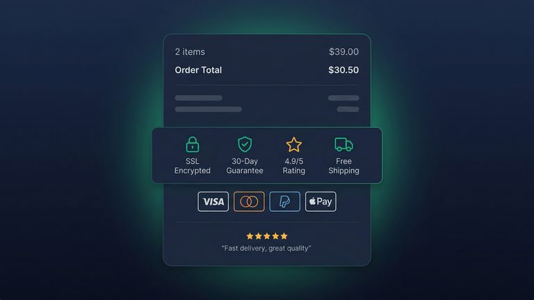
Trust Signals at Checkout
The customer is about to give you their credit card information. They need to feel secure.
What builds trust at the checkout:
- Badges for security (SSL lock, payment processor logos)
- Return policy link visible just before the "Place Order" button
- Customer reviews or trust score visible ("4.9/5 from 500+ orders")
- Multiple payment options (PayPal has a whopping 88.7% checkout conversion rate because people trust it)
- No surprises: display the total, including tax and shipping, before the customer gets to the final step
What destroys trust at the checkout: Unexpected fees appearing at the last step, No security badges, A different design for the checkout page than the rest of the site. Transparent shipping solutions that display real-time rates can go a long way to prevent sticker shock and cart abandonment.
Quick Wins for WooCommerce Checkout
These are the quick wins to implement with the least amount of effort, yet they have a significant impact on your WooCommerce checkout conversion rate optimization efforts:
- Enable guest checkout in WooCommerce settings
- Remove unnecessary fields (company name, order notes for B2C stores)
- Auto-detect country from browser or IP
- Auto-fill city/state from postal code
- Add PayPal and Apple Pay as express options above the form
- Show shipping costs on the cart page, not at checkout (no surprises)
- Reduce to one column layout on mobile
- Add a progress bar if using multi-step checkout
- Test your checkout monthly by actually placing a test order
Most stores can implement these quick wins within a day. The impact of these quick wins is seen on your revenue generated the following month. If you want to dive deeper into WooCommerce checkout customization, our checkout customization service includes all of the above and more.
Measuring the Impact
Before making any changes, you should first measure your current performance:
- Cart-to-checkout rate: What percentage of people who put items in their shopping carts go on to start the checkout process?
- Checkout completion rate: What percentage of people who start the checkout process go on to finish?
- Average time to checkout completion: Generally speaking, the less time the better.
- Error rate: How often do form validation errors occur?
Make one change at a time and measure the impact over a period of two weeks. Small improvements can add up. It may not seem like a big difference to improve your checkout completion rate from 30% to 35%, but if you're making $100K per year with that traffic flow, that's an extra $16,000+ per year in sales from the same traffic.
But the best part is that checkout optimization can improve any business regardless of what industry you're in or what kind of products you sell or what kind of traffic you get. More people checking out means more people buying from you. It's that simple. When you combine good user experience with your checkout process and data-driven testing, you can create a checkout process that gets better and better over time.
Want a Checkout That Actually Converts?
We improve WooCommerce checkouts where a 15-30% improvement in conversions is normal. Personalized flows, express checkout, and recovery of abandoned carts.